Top 5 Reasons to Learn PowerPivot -Training for Results
Hey there! Have you discovered the power or PowerPivot for Excel yet? Or are you stuck with boring old Excel sheets and formulas that quickly become cumbersome, inflexible and impossible to maintain without pulling out the hair on your head? PowerPivot Training.
What’s this, you say? Do you mean PowerPoint? Do you mean PivotTables? What do you mean? Well, what I mean is the best thing since slicers and absolute cell references ($A$1, if you need an example). What I mean is the most powerful way to get billions of rows of data from your existing SQL databases or spreadsheets and turn them into valuable information that enlightens your decision-making. Also, it could make people fall in love with you.
#1 Better than VLOOKUP
If I got a euro every time I heard someone say that they need VLOOKUP to work with their spreadsheets! The problem is, VLOOKUP isn’t that great. Don’t get me wrong; it’s great, just not that great. For instance, if you add rows to either sheet, you probably need to extend your formula. Then, if you download an updated version of your data, you need to recreate your formula. Or say, you change the order of the columns in your lookup table and you break everything. Oh, and also if you have more than a few hundred VLOOKUP formulas, then your whole spreadsheets slows down to a crawl.
In PowerPivot, you create relationships between your data sources and you’re done. Oh and you type something like this =RELATED(findmethisinfo).
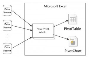
PowerPivot Overview Diagram (c)https://en.wikipedia.org/wiki/File:PowerPivot_Overview_Diagram_Basic_JPG.jpg
#2 Measure Anything Faster Than Lightening
Think of an impossible calculation for your data. DAX formulas in Excel let you create incredible ways to measure and calculate what is relevant to you.
Need to see how well you are doing this week compared to the same time last year? There is a function for that (hint: SAMEPERIODLASTYEAR). Or you need to know how much better? Yes, you can do that too (you guessed right, create your own YearOnYear measure to calculate this year vs. last year). You see, once you create your own measure, such as YearOnYear, then you can use it anywhere – apply to a single date, a whole month, apply to widget sales or geographical regions, or people…
Measures and calculated columns in PowerPivot are super, super, super fast too. Because you can apply them to your millions of rows and they update in a flash (although it depends how fast your PC is, in fairness but still – way way faster than poor old Excel).
#3 Power + Pivot = PowerPivot
I forgot to mention this. If you can use PivotTables in Excel, you can user PowerPivot tables and charts in PowerPivot for Excel. And if you know how to create a chart, you can do that too. Or create a formula, yes, it’s not that different either.
When it comes to PivotTables, the ‘Power’ in PowerPivot means that you can drag and drop fields from all the related tables you add to your model. So now you can easily mash up data from your accounting system with stock levels from your manufacturing database – just drag and drop into the boxes.
PowerPivot can even detect if you are using data from unrelated tables – and help you build a relationship there and then. Told you, it’s better than VLOOKUP.
Apply conditional formatting: traffic light indicators show what’s up, what’s down, what’s different.
#4 Billions of Rows but Compact Workbook
Big Data, they call it. More and more data is available than ever before. It could be your enterprise SQL databases feeding you sales data, the CSV files you download monthly from your accounting package, text files of product catalogues, Excel spreadsheets from your accounting system or stock information from an old Access package you are still maintaining. The thing is, data is everywhere. You can blissfully ignore it for the moment but do you really want to be the last one who knows how to handle all this data?
Do you really want to be the one who spends hours and hours to create reports, when others can do your job in a fraction of the time? A dinosaur?
Oh and by the way, PowerPivot workbooks compress data which means that your workbook file is going to be smaller than ever. Smaller, faster, more powerful. Wouldn’t you love fries with that?
#5 Dashboards
I have a confession to make: infographics aren’t for me. I can’t stand them. It could be because I am not a graphic designer (an excellent reason, in fact) or because I feel that very often they’re about window-dressing very mundane data facts.
Dashboards on the other hand? Oh yes. Dashboards come to life. You promote retail channel sales in Quarter 3 and – pow ! – your dashboard shows an explosion of pie charts beating all records-to-date. In front of your eyes! Filter by currency – wam ! – and straightaway you know that selling widgets to South America was the best idea ever.
Dashboards in PowerPivot can be: PowerView charts, geographical maps (big blob on the region that does well, small blob elsewhere), cards that look like infographics but actually do things when you click them, slicers to cut through your data, filters, drag-and-droppy criteria (not an official term).
#6 Data Feeds
I said five TOP reasons, that doesn’t meant that the list of reasons doesn’t go on and on. Data feeds are public data sources that you can integrate into your PowerPivot data model. Why? Why do you always have to ask why, eh? Well imagine: you are selling sunglasses. Your sales increase in summer. Fair enough. You could have told me that.
With public data feeds what you could do is correlate your sales with weather forecasts, temperatures, geographical elevation, medical data about eye health… As it happens, I am only guessing what you could do with all that data that’s freely available but presumably you know what you will want to find out for your business, right? Well, wait are you waiting for?
So, basically what I’m saying is: don’t be an Excel dinosaur driving your business to extinction, be the Excel data monkey who learns new tricks and saves the day.